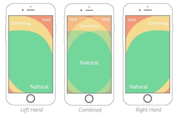
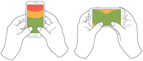
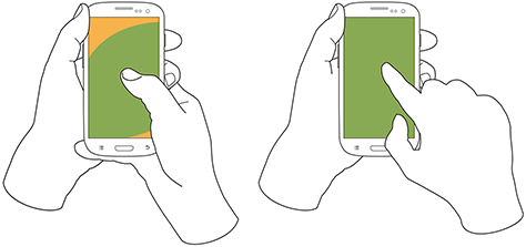
Hardware technologies or even its software development methodology can change. Meanwhile, a human will still have the same five fingers including the thumb. This is a simple yet crucial reason which makes the thumb zone an important factor of mobile UX design. Thus, the principles of so-called “thumb rule” help to prevent both bad usability and users’ joints ‘dislocation’.
Thumbs zone
The term applies to most of both Mobile UX design methodologies and design for touch theory. There are three main zones for a thumb: natural, stretch and hard.

It’s also worth mentioning that thumb/fingers zones might vary due to the use of both hands:

 Fingers vs Touch Screens
Plenty of usability tests and experiments were conducted in order to examine different design element positions, buttons and finger motions. Most surveys have shown that people not only carry out most of the actions on the touchscreen with their thumb but also tend to hold the gadget in the same hand. The trick of an effective mobile UX design is to fit all the relevant details into the thumb natural zone. This is the main way of improving designer solutions quality and providing a favorable user experience. Again, due to these tests, the SMART-task has become the fundamental rule for modern developers.
Navigation difficulties
Today’s variety of mobile UX navigation templates requires a special “thumb zone” guide creation. A crucial thing is to pay attention to the user’s motions naturalness. Long lists of links, mixed menus, and website integration are the decisive points of using the following navigation triggers:
- Full-screen overlay mode lets to fit all the links into a “thumb zone” with the rest of the content.
- The option to fit a few links’ items is to use a fixed sticky menu. It can be placed at the top or bottom of the main screen.
- Sometimes an app has to provide a lot of items in order to be compatible with the web version of the service. This can be solved by combining a sticky menu for most relevant links and a full-screen one for the rest. Facebook mobile app interacts this way.
User-friendly card mobile UX design
The trick of card design is splitting information into small portions and always come up with the right one according to relevant actions, data etc. However, the disadvantage of such solution is that disregards the thumb zone in some case. A good example is a ‘Close’ or ‘Cancel’ icon, which is commonly placed in the left corner. The modern design allows to place these buttons at the bottom and there’s some hope that this relic of the past, i.e. classic displays will gradually disappear.
Gestures and motions
Standard gestures are tap, double tap, swipe, click, drag, and lock. The challenge is to let a user make these gestures in the most natural manner. There is a number of swipe gesture features defined via swipe tracking scripts. The general position of a swipe neither horizontal nor linear. This means, that a swipe gesture needs to be accomplished in the natural thumb zone without doing any other accidental motion.
Summing up
To sum up the importance of the so-called “thumb rules” for mobile UX design the following conclusion can be reached:
- Mobile devices and program languages will keep on developing. Therefore, some of them will gradually become obsolete and disappear completely, meanwhile, the new ones will appear. However, the “thumb zone” will remain
- A certain successful solution has to be based on both: test standards and custom experiments
- Navigation design is about prioritizing the closest to the thumb items that are used more often
- Card design is when users ‘shuffle” them by their thumb
- Swipes need to be designed according to certain scripts
The Adoriasoft company has over eight years expertise in mobile app and UI/UX development. Our team consists of highly-qualified specialists, who are always ready to invent and implement fresh ideas. If you are interested in a great UI/UX design for your project, contact our mobile app development team to get a free consultancy!
P.S. There’s an article from our team about 4 main differences between the CX and UX design. Consider browsing it, if you are planning to launch your own mobile app.