
The most important about Material Design (MD) is that it is a visual communication elaboration of such level that combines main principles of good design and latest innovations. MD is also good because it’s based on the specific requirements and rules. They help to understand how to interact with smaller gadgets, been still based on the same four major MD principles:
-
- Tactile surfaces. Material Design consists of tangible layers of so called “digital paper”. These layers are located at a different height, that helps users to better understand an interface anatomy and its principles of interaction with them.
-
- Print design. Along with “digital paper” and “digital ink” on it MD uses traditional graphic design approach of magazines and posters
-
- Meaningful animation. Objects don’t appear or disappear from or to nowhere unless it’s a movie. This is why material design actually cares about how to give users tips of interacting with the interface.
- Adaptive design. It is about how to implement the rest of principles for different devices with different display sizes and resolutions
Here are some Adoriasoft cases of MD developments. Let’s have a closer look at their design principles:
1. Tactile surfaces
This is exactly a sort of “digital paper” pieces which have a “superpower” to stretch, unite, and change their form. The rest of their behavior is according to the physical and legal laws.
- Surfaces
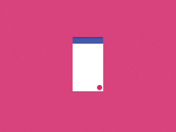
The definition of a surface in Material Design is a sort of container with shadow. But this is enough to differ objects and show their mutual configuration. The MD purpose is simplicity and cleanliness. Moreover, there is no point to go too deep and set a texture, use gradients in order to show checkered light and shadе. An accurate shadow can replace almost any surface visual feature and each of it has its own height relative to axis Z. Each of an upper surface drop a shadow on the lower one the same way it does in the real world.
- Depth
The traditional “flat design” avoids shadows, which shape the bulk, but their function is to shape a structure and element hierarchy on the display. For instance, if an element is higher, then its shadow is bigger. This enlarged depth helps to focus the user’s attention on the major things in an elegant way. The depth also sets interaction tips while elements move, scroll etc.
It is important to mention that the depth has its “bottom” and is limited by a gadget thickness. E.g. if it is a 1 cm at the smartphone between its display and back cover and there is a credit card in your interface, then you can’t just “turn” it as long as it stick.
2. Print design
This principle also consists of several adaptations of classic ones:
- Elegant typography
Typography plays a very important role in the print design: brand style formation and content structure.
- Font size
Google advises the font palette as well as standard sizes for Roboto and OTF fonts
- Contrast typography
A classic print design method of a big difference between the title and main text font sizes in order to emphasize the main things.
- Modular grid and guides
It is about margins in order to keep core content in the middle and center of a page in front of a user’s eyes
- Geometric icon graphics
Libraries of even more simple and friendly icons that have already been used for Android
- Color
There are primary and accent colors in Material Design. The first one is more for such fields as action and status bar, whilst another one is for control elements, buttons, indicators etc.
- Beautiful photos
A beauty of picturesque photos along with its simplicity and minimum of functional control elements
3. Meaningful animation
The realism of it is its practical function of explaining a user what has actually happened, but not some miracles of appearance and disappearance:
- Asymmetry
The changing of an object’s width and height is independent in order to keep the zoom in or out illusions
- Reaction
Whenever and wherever it’s possible, the starting point and focus of animation has to be caused by the user’s touch
- Micro animation
Extra details and yet again responsiveness of small elements
- Clarity and sharpness
Every animation movement has to be fast, accurate and designed according to realistic MD animation curve
4. Adaptive design
The last but, possibly, the most respectful Material Design principle is making a unified look for almost every device
- From general to specific
The smaller the device’s display is, the less number of details can be fitted into its single screen. What’s more, important details should be shown to a user first
- Padding
It is important to simply keep blocks not too tight but still in the focus of user’s attention
- Whiteframes
Successful design is more probable if a designer is aware of as many space organizing ideas as possible
- Runners
It is important to standardize different margins for each single paper and different devices
- Sizes
Despite different devices dimensions, the proportions of app bars and the rest of elements can still be multiples of each other
- Blocks
Whilst block thinking can be useful in general, module grid of block can set a useful visual rhythm
- Toolbar
An action bar is one of the major interface elements, that can be both hidden and used as an app widget
This is what material design is about: be patient and brave to make experiments and overcome mistakes.Thus, it’s better try something new than copy existing solutions.
Looking for professional designers to work on your project? Contact Adoriasoft today to receive a free consultancy and estimation of the work needed to implement your project!