
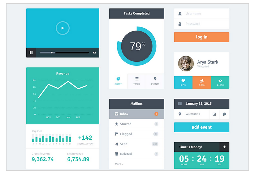
Mobile app design is vital for any business today if it aims to provide excellent user experience. According to studies, users spend 89% of their smartphone media time in mobile apps. That’s huge! Moreover, more than 50% of people wake up and start using their mobile phones immediately. This knowledge dramatically increases the importance of a mobile app design.
An essential part of the mobile app design is color scheme. One simply can’t underestimate the power of color in apps. Right color scheme helps not only set the mood for your app, so users could interpret it they way you want them to. It also assists users to interact with certain elements and understand important actions within the app.
When making a decision about a color scheme and primary colors in the app designers can go two ways: traditional and custom color palettes. Traditional color schemes include analogous, monochromatic, triad, complementary and compound. Custom color schemes are ever-evolving field for experiments though. The main challenge is to select the color scheme, which is trendy enough and at the same time effectively supports mobile app usability.
What’s common for every color scheme is the color wheel. By combining colors of the color wheel designers build a distinctive color scheme and thus achieve a certain effect. Let’s look at 14 trendy color schemes that designers successfully use:
Mobile App Design: Analogous Scheme
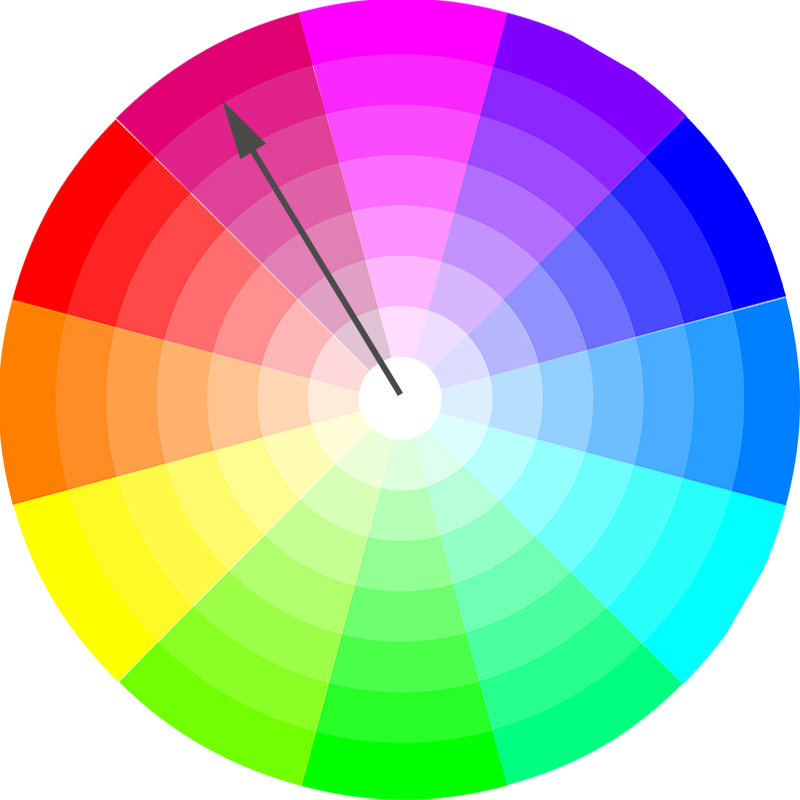
Analogous color scheme is one of the traditional color palettes that designers use. It is a combination of related colors that are situated next to each other on the color wheel. Usually one color is dominant, while other enrich the scheme. However, all colors in the analogous scheme can also be used equally in some designs. Analogous colors are easy to find in nature. They are very harmonious and that’s why are so pleasing for the eye in mobile app design.

Analogous scheme on the color wheel

Mobile App Design: Monochromatic Scheme
Monochromatic color schemes use one base color, its tints and tones as an extended palette. Such schemes create a comforting effect for the eye, especially if greens or blues are used. To get a tint designers add white to the base color, while for creation of shades you need to add black or grey. With a monochromatic scheme designers are able to achieve a simple, yet cohesive and elegant look of the mobile app.
Monochromatic scheme on the color wheel
Mobile App Design: Triadic Scheme
Triadic color scheme is based on the combination of three colors, which are evenly situated on the color wheel. The secret of success using triadic scheme is to let one color be dominant and use others for emphasis. Thus harmony in the triadic color scheme achieved by balanced use of all the colors.
Triadic scheme on the color wheel
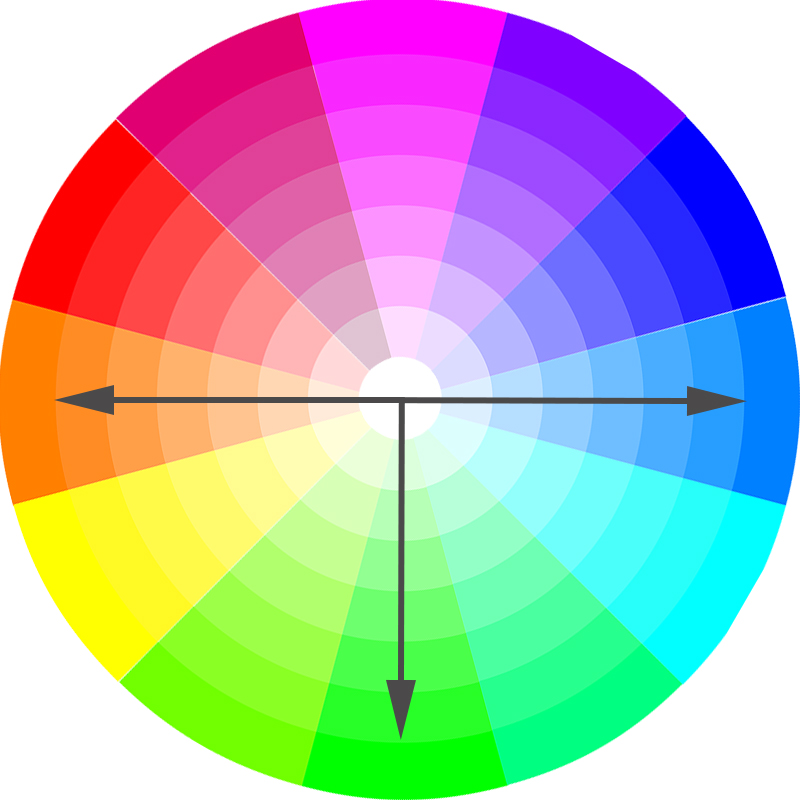
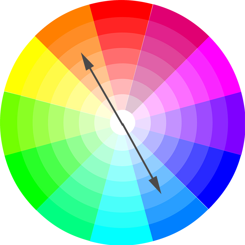
Mobile App Design: Complementary Colors Scheme
Complementary colors are situated on the opposite sides of the color wheel. Examples of complementary colors are red and green, orange and blue, yellow and purple. They contrast each other strongly. So designers use complementary colors if they want some element in the mobile app UI to stand out.
Complementary colors on the color wheel
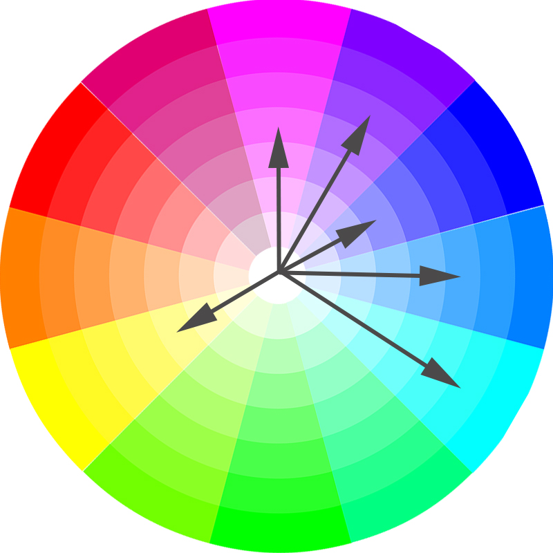
Mobile App Design: Compound color scheme
Compound color scheme is also known as split-complementary. It uses base color and two analogous colors. Compound color scheme is almost as contrast as the complementary scheme. However, it has less visual emphasis than complementary color scheme.
Compound color scheme in the color wheel
Mobile App Design: Color Shades
Shades are created by adding black to the base color. A color scheme using shades allows to achieve an attractive and integral mobile app design. Color shades are very effective for accentuating certain areas or important functionality of the app UI. They are also useful for creation of visual connections.
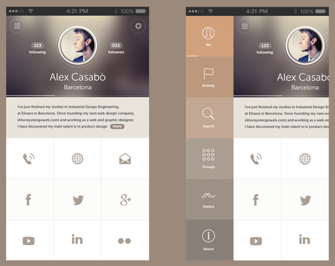
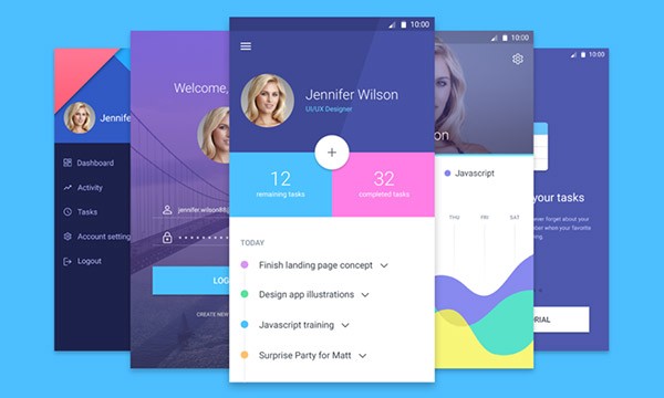
Mobile App Design: Custom Color Scheme
Custom color schemes must be carefully made up using the best practices of the color wheel combinations. Experienced designers can leverage advanced color combinations in mobile app design. However, beginners should opt for traditional color schemes before jumping into complex color experiments. Successful custom mobile app designs most often use minimum base colors (1 or 2) and shades, because they allow to achieve fast visual connections with the brand.
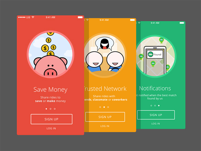
Mobile App Design: Colorful illustrations
Onboarding slides with colorful illustrations are a very common practice in mobile app design today. Especially effective colorful illustrations are in minimal mobile interfaces. Usually they play a powerful contrasting effect and thus help to convey the brand message strongly. Bold and colorful illustrations within the mobile app design also provide a bit of liveliness and playfulness. They easily captivate mobile app users.
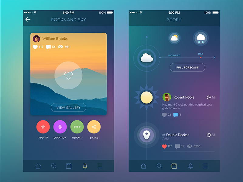
Mobile App Design: Colorful Gradients
One of the interesting trends in the mobile app design of the recent years are colorful complementary gradients. Earlier same-color gradients were the norm, but today high-contrast complementary gradients are. Transitions from red to orange, purple to blue allow to achieve beautiful visual effects. However, it’s important to use such bright colored gradients with minimalist iconography and imagery.
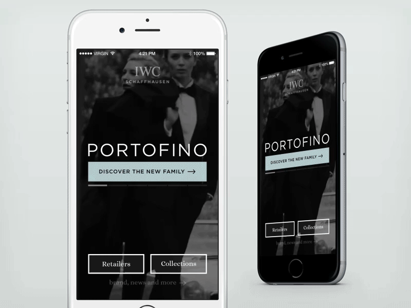
Mobile App Design: Black & Shades
The trend of minimal mobile app design has inevitably resulted in the minimal use of colors. Just like a little black dress became a symbol of elegance in fashion, so the black color in mobile user interfaces now plays a sophisticated role. While the black color always stands out from the whole design, together with whites and greys it can create a highly contrasting scheme, yet not brutal.
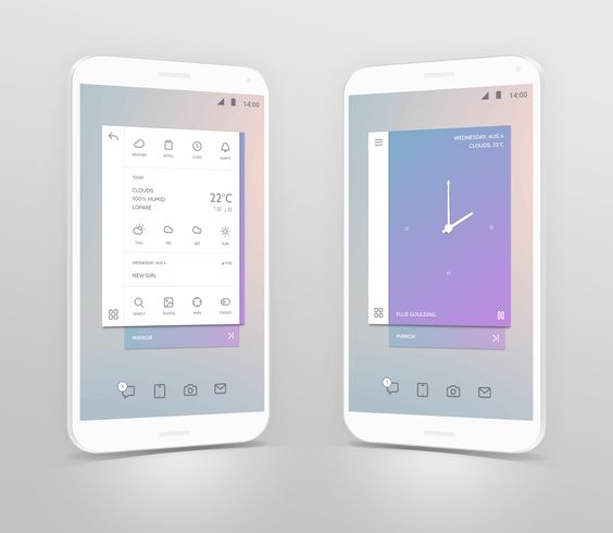
Mobile App Design: Pastel colors
Pastel, muted colors in mobile app design is another great trend for designers to watch. In fact, they help to achieve visual balance in the mobile user interface. In a distinctive way pastel colors provide harmonious experience for mobile users.
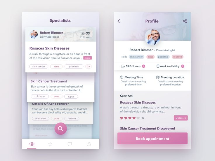
Mobile App Design: Bright Icons
Today designers use bright and bold iconography to differentiate actions and elements in mobile user interfaces. Bright-colored icons make a great visual impact in mobile UI. They also let mobile users easily understand the mobile app flow, its message and user scenario.
![]()
Mobile App Design: Subtle Shadows
The usage of subtle shadows on muted or white background is one of the effective trends in modern mobile color schemes. Generally, subtle, yet colorful shadows help designers to create interesting and beautiful visual effects for users.
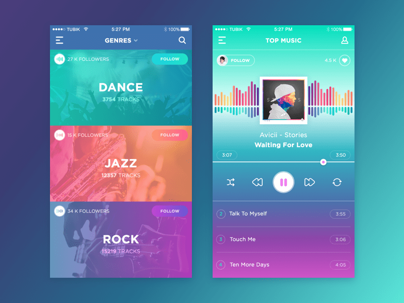
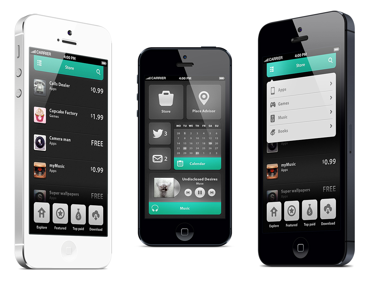
Mobile App Design: High-Contrast Colors
High-contrast colors in mobile app design appeared after the introduction of Apple‘s iPhone 7. Bright turquoise blues, pinks, reds, greens have a significant effect in modern high-contrast mobile interfaces. What’s more, mobile apps with high-contrast colors help to provide a user experience of clear visual impact.
Are you interested in mobile app design for your Android or iPhone application? Contact Adoriasoft for top-notch UI/UX consulting and mobile app design creation today!