
Today’s mobile apps hardly avoid interface animations. Even the simplest and imperceptible interface element animations make the user contact more realistic. The efficient development of UI mobile app animation can be vital to the success of the mobile app, distinguish it from competitors and even engage fans. It also improves the usability and users loyalty. Most of the mobile app developers have caught this trend and its benefits.
In 2014, Google launched the material design concept. And it has become one of the main jets of the mobile interface animation trend. The core of MD is correct objects motions and impressive responsive animation. It should solve the following tasks:
- Provide feedback towards user actions inside the app
- Help user to get used to app and its interface
- Reflect app status
Adding animation to the mobile app is a rather grueling work. Every detail which is excess, designed incorrectly or located at the wrong place can ruin all the impression of the mobile app interface. In order to make animation function properly, a UX designer needs to follow certain principles:
1. Animation is good when it’s reasonable
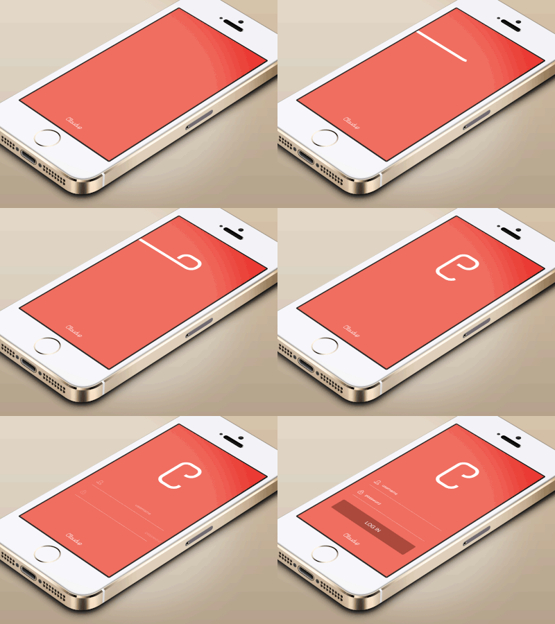
Before the development of mobile app within the interface animation, it is important to check if this idea is consistent with the principles of the apps animation usage. This will minimize the risks of the user’s dissatisfaction.
 |
 |
|
 |
 |
|
2. Mobile app animation has to follow the standards of the mobile OS you are developing it for
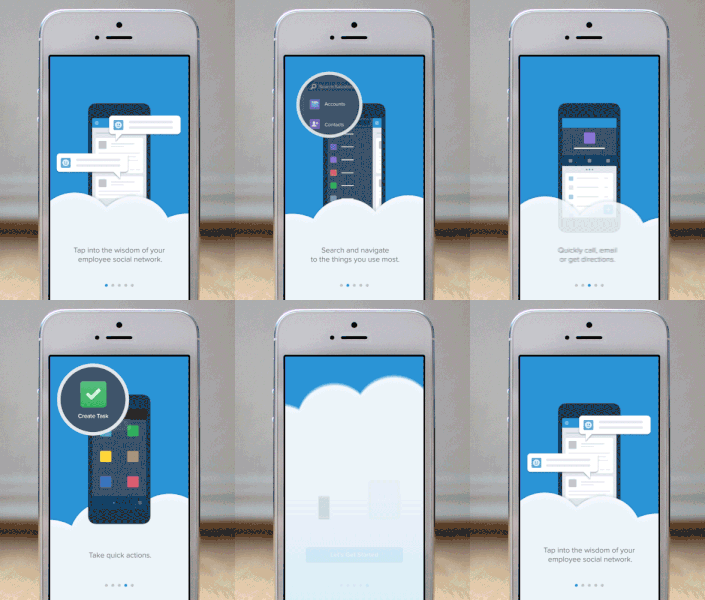
Each mobile platform has its specific recommendations of design and animation in order to make every development to fit in its concept and to look native. Usually, it is possible to find the necessary information on the official pages of iOS and Android. Why reinvent the wheel? OS, Android, and Windows Phone platforms users have got used to their devices operating schemes. Therefore, the best way to start is to animate tasks by means of conventional methods.
 |
 |
Cross-platform framework solutions can’t boast the same quality animations as the native ones do. However, it is also a trend to unify the interface along with its animations.
3. Mobile app animation has to be understandable and intuitive. Its purpose is to help users, not to distract them from the main features and content of the app
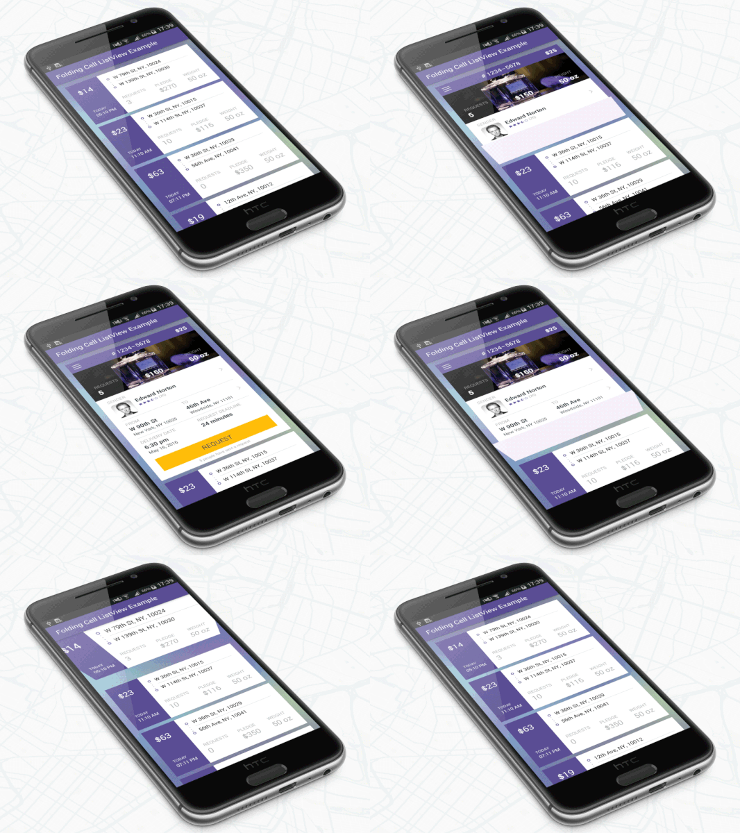
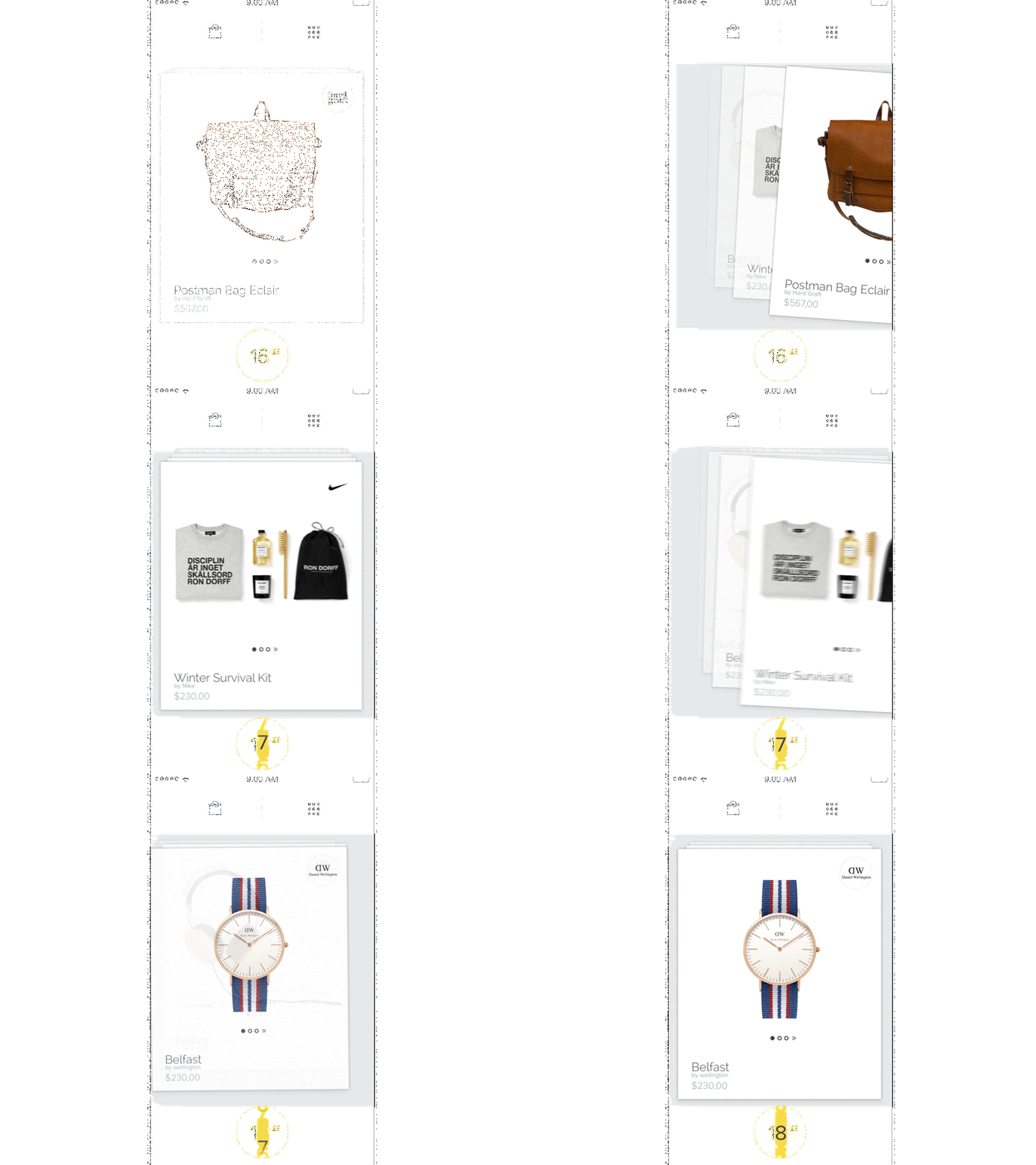
The animation is a visual confirmation of an app reaction to commands. This means, that users need to understand how their actions are linked to app reactions. For instance, a user presses a button and a list appears. If any part of the interface either functions autonomously or executes non-standard actions, it can confuse its users or even irritate them. Being well aware of the object motions in real life, а user expects that from a smartphone.
 |
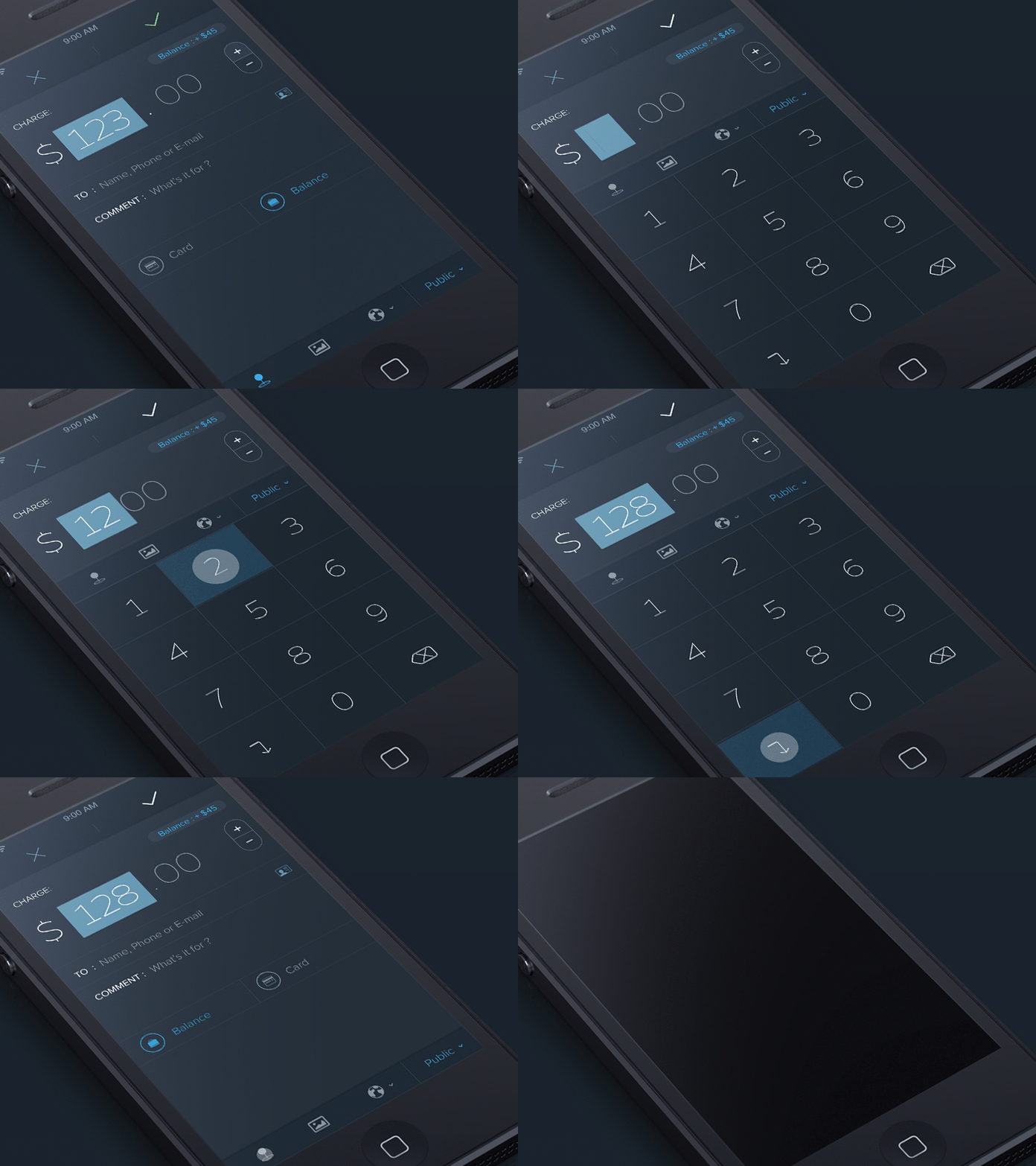 |
In-apps payment animations are with the attention. Being considered as something not entertaining, but serious, mobile payments still can use animation in an effective way.
Keeping the balance between the native methods and reality is an essential principle. Often, developers want to express their individuality in the interface. An animation is a perfect way to do so. Mobile app animation effects can control a user’s attention and motivation to act in a certain way. However, it is important not to overdo with that.
4. Mobile app animation has to be comprehensible and targeted
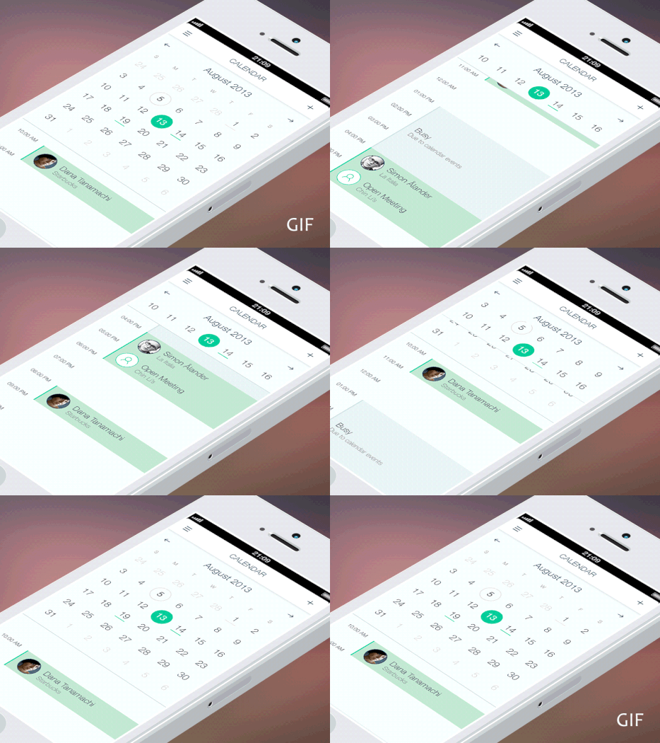
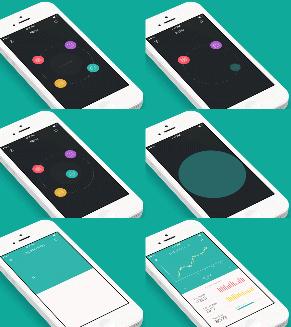
Every action made within the animation effects needs to be well-thought. An animation is used for a targeted user transition among app’s navigation elements, to display app changes when you move between its tabs and to build hierarchy. Moreover, using animation allows to switch the user’s attention from one element to another and to form regular users’ habits.
 |
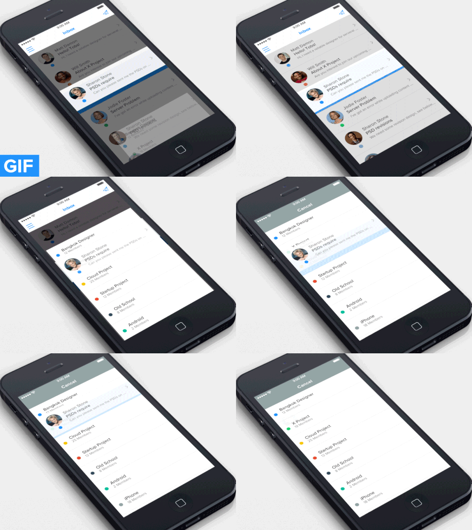 |
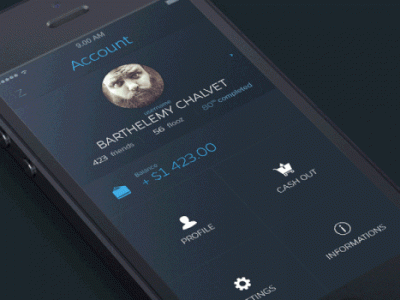
It is important to use reasonable transitions only. Following the conventional hierarchy of the app structure, users shall move in two directions: to the subsection and back to the parent one. This navigation can be animated in a simple way. When a user’s move to the subsection is animated, a sliding goes from the left to the right, and when he is back – it goes from the right to the left. The user catches this way of navigation and uses it in other sections.
 |
 |
5. Mobile app animation has to be flexible and executed in a single app’s rhythm
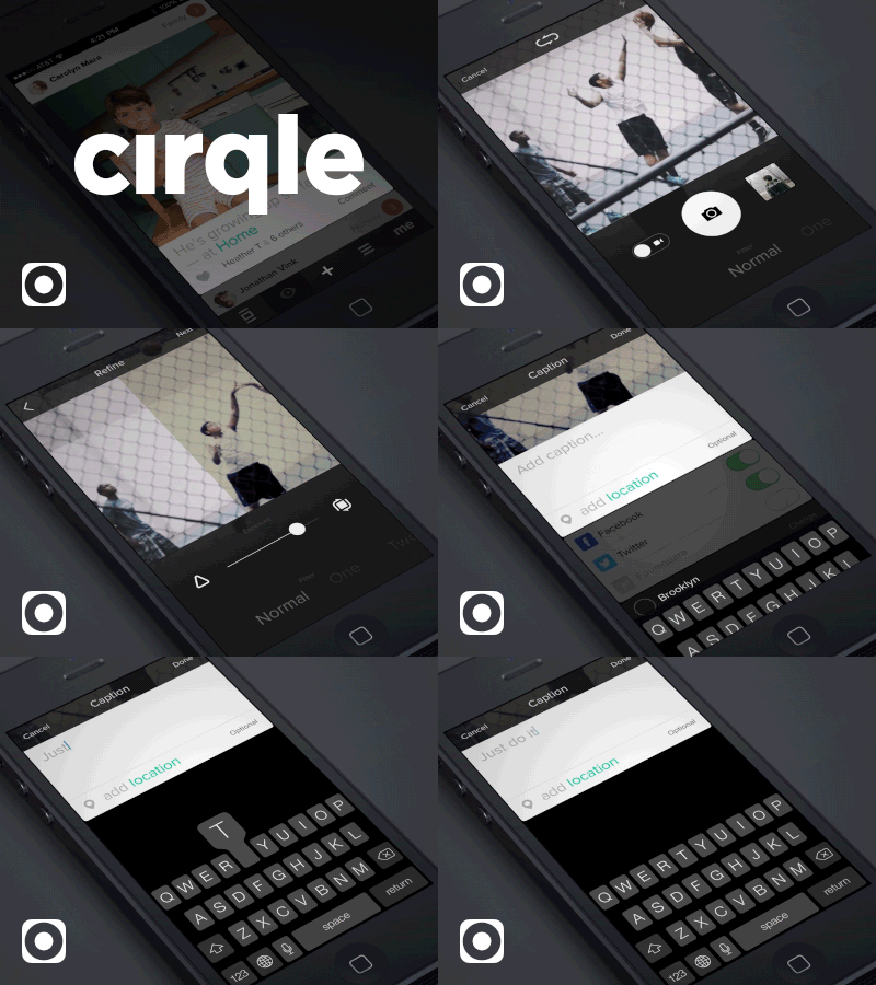
Animation elements should move according to the overall app’s concept and with approximately the same speed. Any combination of slow and sharp motions can adversely affect the overall impression about the app. However, it is rather risky to set the same speed for every single element of animation. For instance, the buttons don’t need to be as slow as the subsections sliding.
 |
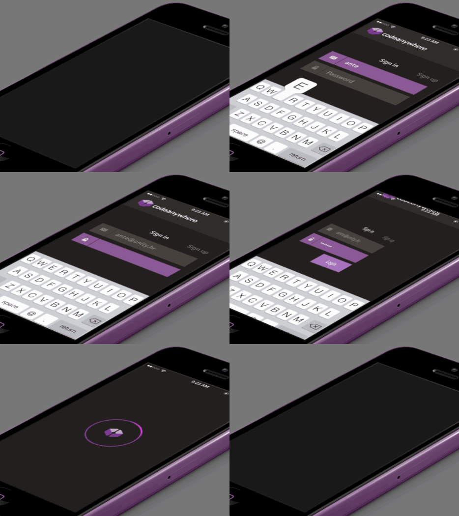 |
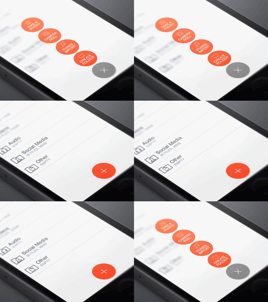
Timing helps to keep equability of animation transitions. This is mainly about the same frame rates of each movement, that let smooth animation elements. The user’s eyes adapt to a single rhythm and help to perceive it in an intuitive way.
Smartphone users are very accustomed to animation inside the mobile apps interfaces. The absolute absence of animation might look boring and obsolete. So the demand for an animated mobile app development continues to grow. If animation is designed according to the rules, it leads to the positive user perception of the interface and motivates them to use an app more often.
An Adoriasoft team has over 8 years experience in mobile apps development and software solutions. We use the sophisticated image processing techniques, as well as advanced programming algorithms. Contact us if you need any expert help with creating an effective mobile app animation. By the way, we offer an absolutely free estimation of your future project.
P.S. In addition, we would like also to recommend you our handpicked list of top 10 approaches to mobile apps monetization. Consider browsing it if you are interested in finding ways to make money on your app.