Web design trends are changing as rapidly as technology does. The web and technology have moved forward in recent years significantly. So has web design trends. In 2016 it continues to reflect changing ways of interaction between users and interfaces. Material design will be taking up its pace further, while sliders and carousels will gradually start to disappear. There are more to these cogent changes, of course.
Here are 30 hottest trends that we think will loom on the web design trends horizon in 2016. Some of them are not necessarily new, however, they will endure this year. Check them up in no particular order below.
1. Interaction-focused Interfaces
Various interactions in mobile interfaces and apps play crucial role by linking users and devices. Moreover, the simpler interactions appear the more value they tend to bring to customers. Effective, seamless interactions on websites and apps eventually impact users’ loyalty to associated brands. Creating great interactions often means designing such simplest elements as buttons, blips, alarms to messages with laser-like focus and accuracy. One of the great examples of effective microinteractions is the Twitter’s ‘pull-down-to-refresh-news’ feature.
https://vine.co/v/bEblaqQrxm0/embed/simple
2. Modules & Components
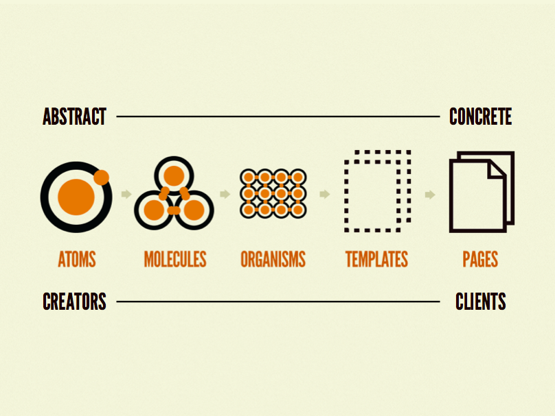
Breaking down complete interfaces into systems of components goes mainstream. Web designers tend to create mockups with smaller blocks and modules, rather than deliver entire page layouts upfront. The methodology behind this is not new to us, however, it was finally put into shape and legalized by Brad Forest to what is known as atomic design. The concept of design systems implies a nice opportunity to use the same functionality anywhere on the website with replicated components. Also for web designers gradual increasing the fidelity of interface design means deeper understanding of the layout concept on each design stage by their clients.
3. Stunning Fonts
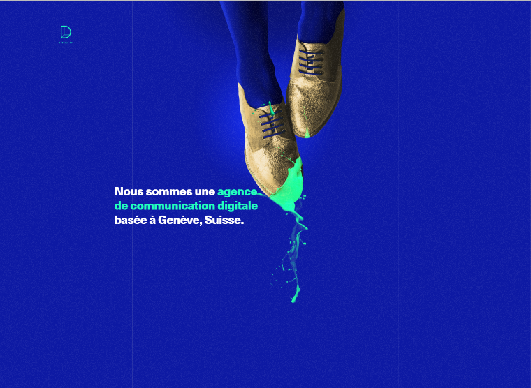
Beautiful typography is widely used for logos, headings, menus and key messages to stand out on minimal designs. Use of Sans Serif font-family will prevail, as well as impressive hand-writing will be broadly spread. In 2016 priorities shift to bolder and larger fonts in corporate designs as a weapon to convey brand messages in a stronger manner. The overall requirement to typography stays the same: fonts must be easy to read and legible both on high-resolution and lower resolution screens.
4. Hamburgers
Hamburger menus tend to supersede mega navigations this year, but the latter will not vanish completely. Massively used in responsive web design hamburgers are equally well perceived by desktop and mobile users.
5. Card-layout Interfaces
Grid layouts are common nowadays with cards helping to present information visually in a laconic way. Hover effects on cards amplify users’ perception of text descriptions. The trend is not new as it has been popularized by Pinterest. Nevertheless, card-style layouts are still in fashion this year and work.
6. Tiny Animations
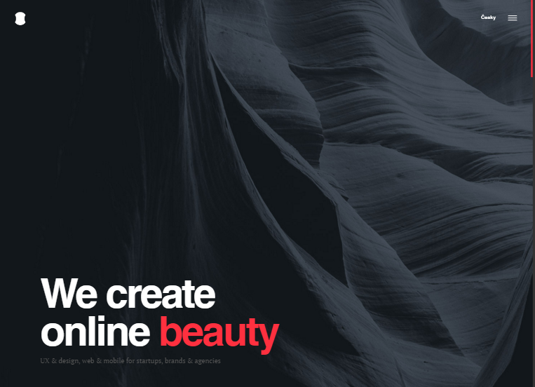
While there are more and more websites with alike minimalist layouts web designers try to achieve uniqueness by using ingenious, but subtle animations. In 2016 web designers give preference to small animations that carry out certain tasks efficiently and smoothly.
7. Enlivening Iconography
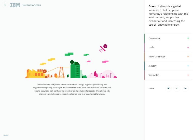
Under constraints of conventional minimal layouts web designers try to play with iconography to a certain degree. Icons appear to be bolder, bigger, smarter and thus pixel-perfect. Often they become focal points of the whole layout.
8. Prominent Video Headers
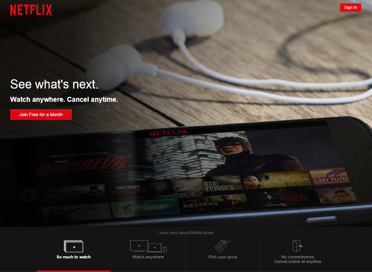
Often put in the header or in the background videos continue to play the role of dynamic storytelling in website layouts. Web designers who skillfully utilize this method can achieve tremendous results in regards to delivering benefits and values of the company, product or service.
9. Custom Landing Page Videos
Custom videos that explain product/service functionality or company benefits are typical for landing page designs today. This year such explanatory videos are getting more creative and personalized. Custom videos work also great for explaining critical concepts visually in just two or three minutes.
10. Product Previews
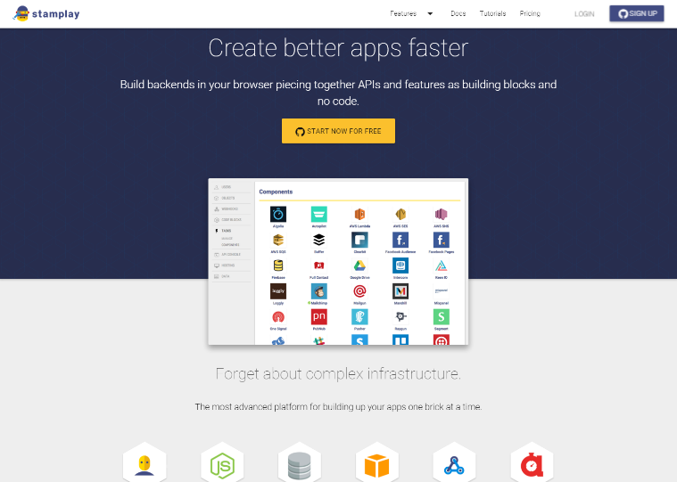
Thanks to better connection speed and faster browser work landing pages and home pages this year will include more product previews. Screenshots, animations, videos will provide an opportunity to have a look at functionality of a product/service without the need to sign up or download the trial version.
11. Stunning Illustrations
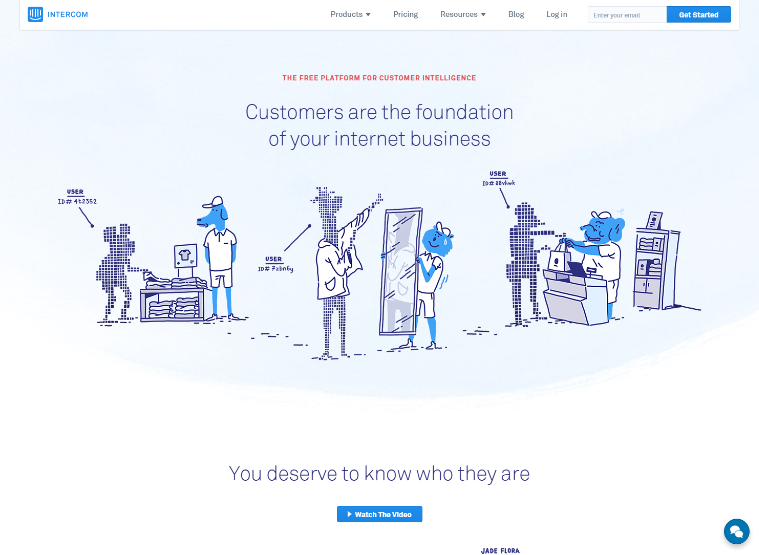
Illustrations are said to connect with users in a more personal way than photos. They give viewers an opportunity to interpret visuals freely, not actually defining them at the same time. In 2016 creative illustrations will have more backers than the year before. Minimalist layouts will go on utilizing stunning illustrations to create even more emotional bonds with visitors.
12. Charming Sketches
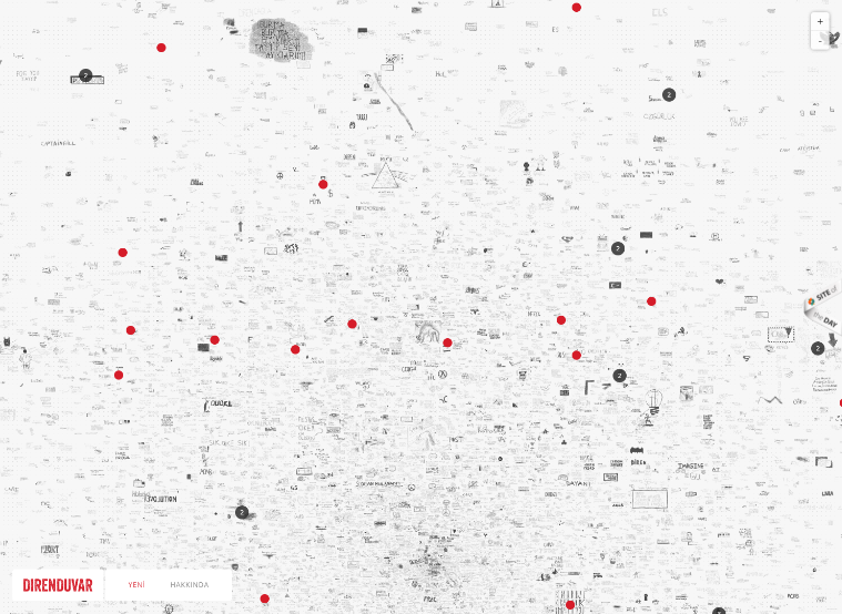
Sketches bring an element of fun and creativeness to website layouts. As well as illustrations sketches help making any interface more personal as they improve overall feel of viewers about product/service. Sketches also help to bring a bit of raw creativity to any conservative layout thus rejuvenating any brand message, look and feel.
13. More Slides & Sliders
Full-screen slides are used for websites widely. Instead of common slide shows, which used to occupy unimportant layout areas, full-screen slides tend to provide almost physical experience to visitors. Timed sliders work to some extent if they are timed well and do not run like crazy carousels. Sliders, which work with a click or scroll will be utilized to highlight important product information or app features. However, both will gradually become obsolete in favor of videos and animations.
14. Less Carousels
Image carousels will be gone in 2016. Extensively used three years ago carousels proved to be of little value to website usability and user value. Often images used in carousels are not properly optimized, which usually leads to longer page load time. Also carousels on home pages generally may be bad for website complete SEO because prominent H1 headers are rarely filled in them and thus valuable opportunity for ranking is often missed.
15. Flatter Web Design
Flat design has been here for already a year or so, but its adoption in 2016 will be significantly larger. New website layouts will continue to use flat design together with bright colours and minimal page schemes. Websites that already have flat design aesthetics will implement even more flat looking designs. So not to be out-of-style this year web designers had better forget about polished buttons and reflections. Everything is about flatter shapes, remarkable fonts and bold colours.
16. Bold & Bright Colours
Bold colours and large colour patterns are to prevail in 2016. Colours will be used in effective contrasts for highlighting major content in layouts. Boldness and brightness of colours throughout the year will continue the fashion of flat design and Google’s Material Design philosophy.
17. Material Design Aesthetics
Google introduced its Material Design two years ago as a unified way to experience its various products. The visual language of Material Design suggests more clarity for interactions, visual hierarchy, conscious use of typography, card-style layouts, limited but bold colours. The trend of Material Design is common today not just for Google-oriented apps and websites. Generally it has been growing to every dark corner of the Web.
18. Own Photography, No Stock
The use of stock photos is so outdated and boring that it hurts. In 2016 both small business and big brands will use and benefit from their own professional photos. A personal message to users matters now the most. No more falsehood in visual content, only naturalness and authenticity delivered by means of custom original photography.
19. Touch-enabled Interfaces
More and more websites use touch events such as swipes and taps in their layouts. Implementation of special plugins that help to apply touch events in web design provide users with more value than responsive design does on its own. Mobile layouts with a variety of touch-enabled interactions become even more adaptable to users.
20. Full-screen Forms
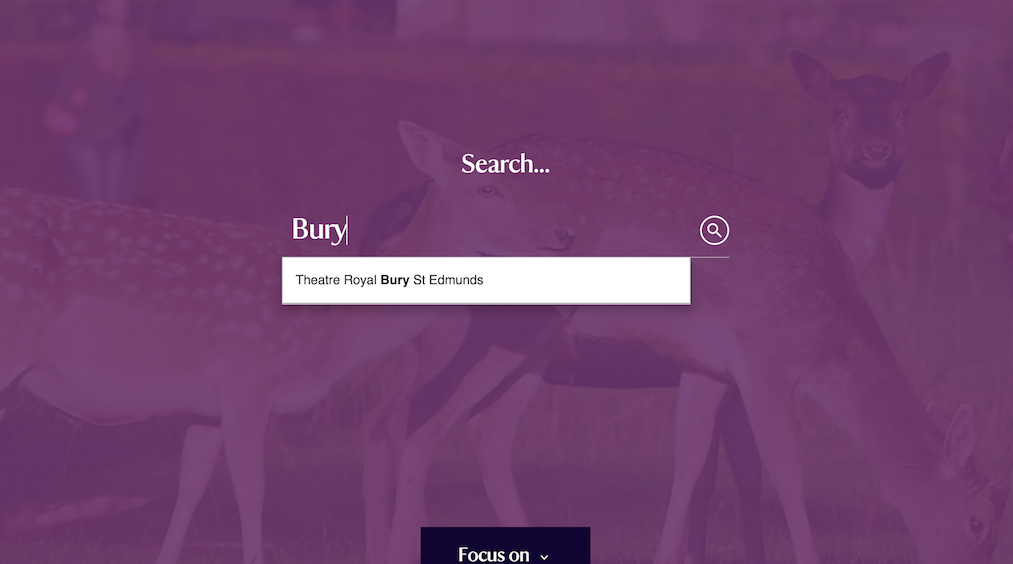
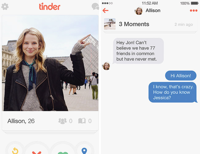
Web design trends in 2016 becomes more mobile-focused. As a result, it becomes a ubiquitous practice for websites to use full-screen forms for conducting such events as signup, subscription to newsletters or handling a search within the website. Full-screen forms if used correctly may allow better focus on the task that is aimed at a user.
21. Creative Hover Effects
Mainly intended for desktop web design a creatively utilized mouseover can beneficially emphasize key interactions in minimalist layouts. The accents done with interesting hover states can give users a clear picture of what is clickable on the uncluttered website.
22. Centered Main Content
Centered layouts look modern, sophisticated and trendy again. Cogently delineating a clear website structure content centring helps to focus visitor’s attention on the website’s core. Combined with beautiful typography centered layouts may greatly enrich interfaces and make user experience more enjoyable.
23. Minimal Home Pages
Minimal home page design seems to be that rare trend, which appears to be timeless. Minimalism in fact will always be beyond any web design trends, because everyone knows that less is more. It’s true. In a minimal layout all elements have to be very well thought-out to work for users. Texts must be polished so well that they convey a brand message, its unique selling points strongly and elegantly. Laconic, minimal web interfaces make responsiveness a very easy task, while white space provides room for breathing and calm user experience.
24. More Scrolling vs Less Scrolling
Above the fold or no fold at all? That is the question when it comes to scrolling trends in 2016. Both websites with layouts intended for long-scrolling experience and websites designed for no scrolling will exist this year. Visitors are equally eager to scroll below the fold and be glad to see that all major messages appear above the website’s fold. The key point here is that website design should still stay focused on functionality and easy navigation while ensuring a pleasant and memorable user experience.
25. Large Body Text
Large body text drives action. Moreover, use of large fonts three years ago still impacts user experience today, namely speed of actions taken by users on the website. The larger the font is, the clearer the message is to users. Large typography works great for mobile layouts and for desktop ones too.
26. Faster Page Load Times
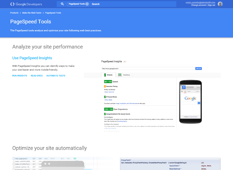
Tracking multiple marketing activities integrated into a web page often requires implementation of various pieces of Javascript in it, which may lead to slowing down overall page loading. In 2016 web designers work hand in hand with marketing unit to make every possible effort in optimization of web page loading times. Faster page load times can be achieved by compressing excessive Javascript in gzipped archives, using Google Tag Manager for tracking purposes and CSS tricks to bundle visuals.
27. Hypnotizing Cinemagraphs
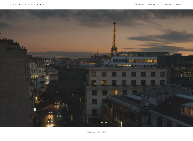
Bringing a segment of a photo to life using cinemagraphs is a popular web design trend in 2016. Cinemagraphs are used everywhere: from online TV advertising, display campaigns to social media content. These hypnotizing visuals are known as a powerful tool to drive consumer engagement both for small businesses and global brands.
28. Use of Collaboration Tools
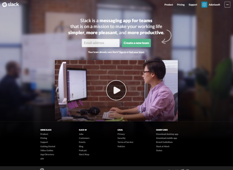
Slack, Invision, Marvel, Sketch, Principle, Adobe Comet, UXPin … The list of online collaboration tools used for design purposes goes on and on. In 2016 more web designers will create layouts in browsers. Time is money and browser based collaboration tools used for design purposes may significantly save up time on discussions with clients and final mockups implementation.
29. Good Functionality Over Good Looks
User-oriented web design trends is about what users consider to work for them best in web and app interfaces. Users are the final authority to impact any web design decisions. What users choose is a great website functionality, no matter how beautiful a website looks. In 2016 and years ahead all web designers should be driven by the goal to create a balance between good website functionality and its visual attractiveness.
30. Design Driven By Users
Research, research, research. The biggest web design trend of 2016 is web design driven by insights discovered during an ongoing user research. Web designers create interfaces for users to interact with, so it’s users who are at the focal point of any design decision-making.

The list was compiled by Adoriasoft UI/UX consulting team.
